Product photography prompt for a matte black studio speaker
Product photography prompt example for a restrained consumer-electronics hero image. This page documents the exact prompt attached to the existing site-generated asset, then explains the visual decisions a reviewer can verify.
Published August 31, 2026 · Updated August 31, 2026 · Created and reviewed by GrokImage20.com from the recorded prompt and visible asset.
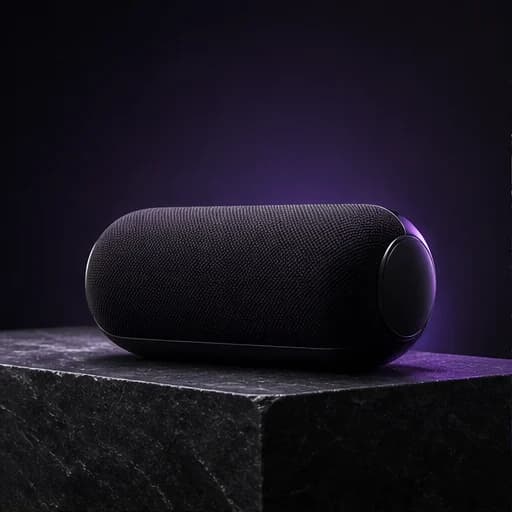
A matte black wireless speaker on a dark stone pedestal, three-quarter view, soft directional studio light, warm neutral background, 4:3, no extra objects.
The recorded prompt asks for 4:3 framing; the gallery presents a square crop of the finished concept.Open this promptThe brief in verifiable parts
- Intended use
- Consumer-electronics hero image
- Subject
- Matte black wireless speaker
- Mode
- Text to image
- Composition
- Three-quarter product view
- Prompt framing
- 4:3
- Gallery crop
- 1:1 square
- Main review risk
- Dark-edge and product-detail accuracy
Method: this case connects one recorded prompt with the visible site asset. It is a creative analysis, not a controlled benchmark or a promise that another generation will reproduce the same pixels. Prompt-directed framing is reported separately from the square gallery crop, and unknown provider settings are not inferred.
What the prompt is trying to control
This prompt is built around one product, one support surface, and one lighting idea. Naming a matte black wireless speaker establishes both the object and its material response. The dark stone pedestal supplies a stable visual base without introducing a branded set. Three-quarter view asks for enough front and side information to make the form understandable. Soft directional studio light gives the image a clear source while avoiding the harsh reflections that can make dark electronics look cheap. The warm neutral background separates the cooler black object from its surroundings. Finally, no extra objects protects the negative space and keeps the result suitable for a product hero area.
Composition and hierarchy
The strongest compositional choice is the three-quarter view. It creates depth while keeping the speaker recognizable, which is useful for ecommerce headers, launch concepts, and presentation mockups. The pedestal anchors the product and creates a deliberate vertical hierarchy: background, support, then product. Because the prompt asks for no secondary props, the eye has nowhere else to go. That simplicity also leaves room for later cropping or interface copy. The square gallery crop is a presentation decision, not evidence that a square aspect ratio was used during generation. When adapting this prompt, describe where copy must sit and select the matching output ratio in the generator rather than relying on a crop to solve every layout.
Lighting and material language
Dark products need explicit light behavior. A generic request for dramatic lighting can create clipped highlights, muddy edges, or an object that disappears into the background. Soft directional light is more specific: it should create a readable highlight gradient and a controlled shadow. Matte black tells the image model to avoid a mirror-like finish, while stone adds a contrasting mineral texture. Warm neutral background is intentionally broad enough to allow beige, taupe, or muted brown, but narrow enough to avoid an unrelated colorful environment. For a glossier product, replace matte with satin or polished and describe the desired reflections. For accurate commercial use, verify every port, control, seam, logo area, and proportion before publication.
How to adapt it for a real campaign
Start by replacing the generic product noun with an accurate description of your own item, including color, finish, and the features that must remain visible. Add a placement instruction such as centered, left third, or right third only when the destination layout requires it. If the image will carry a headline, name the empty region and its approximate size. You can swap the stone pedestal for acrylic, wood, brushed metal, or a seamless sweep, but introduce one surface at a time. Reference-image editing is preferable when product geometry must stay faithful. Upload an approved packshot, describe only the environmental and lighting changes, and compare the output against the source before using it in ecommerce or advertising.
Review checklist
Inspect the silhouette first: the product should read immediately at thumbnail size. Next check edge integrity, symmetry, grille patterns, controls, and contact shadows. Look for impossible reflections or a pedestal that merges into the speaker. Confirm that the background stays neutral and that unwanted props, text, or pseudo-logos have not appeared. Test the crop at the actual website breakpoint, including mobile. An attractive full image can fail when the product is hidden under navigation or a call-to-action. Keep the original prompt with the approved asset so future variations can preserve the same visual system. AI output is a creative starting point; factual product representation and rights clearance remain the publisher's responsibility.
Likely failure modes and the next useful iteration
The most likely failure is loss of separation between a black speaker, a dark pedestal, and a shadowed background. If the silhouette becomes muddy, preserve the camera view and product scale while asking for a slightly brighter edge light or a lighter neutral backdrop. If grille texture turns uneven, do not add more atmosphere; simplify the surface and request consistent woven detail. A second iteration should address only the largest visible problem. Compare it at the intended ecommerce size, because an improvement visible at full resolution may disappear in a compact product card. Keep any corrected source image as the new reference when geometry matters more than novelty.
Continue with the right workflow
Use the AI image prompt guide to build another brief from subject, environment, composition, light, and constraints. The complete generation workflow explains aspect ratios and review passes. When a real product or existing visual must remain recognizable, follow the reference-image editing guide and state both the requested change and the details that must stay consistent.
Adapt the decisions, not just the nouns.
Open the generator with this recorded prompt, then change its subject, layout, and constraints for your project.